


Putting the User First — a Gentle Opening
For many designers and brand owners, the goal is simple: present fragrance in a way that reflects the wearer. This article focuses on that user need, and it is written with careful attention to practical choices for a Personalized perfume bottle. The tone here is polite and structured, and I will explain how form, color and finish can help convey identity while remaining manufacturable and market-ready.
Why Personalization Matters for Your Fragrance Line
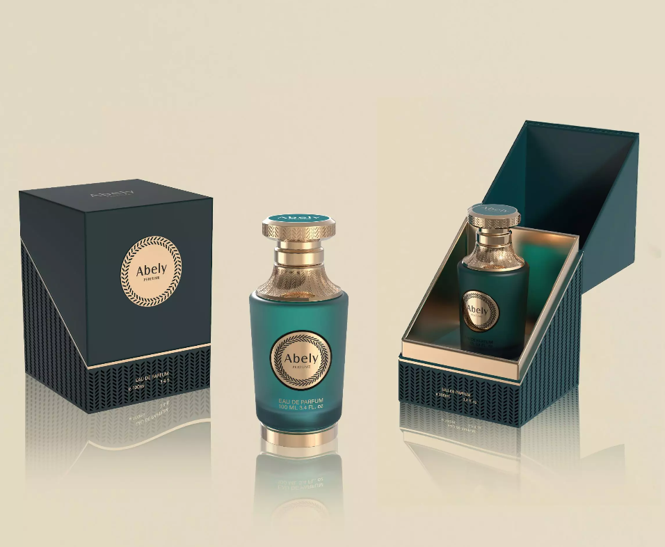
Customers increasingly expect products that feel bespoke — a trend visible in both consumer tech and lifestyle goods. Design weeks such as Milan Design Week have highlighted how color and finish influence perceived value; packaging becomes part of the story. A well-chosen bottle is not merely a container: it is a communication tool that signals quality, mood, and brand intent. For many niche brands, inside color coatings and translucent hues on color perfume bottles transform scent into a visible signature.
Key Design Considerations for Brands
When you design a personalized bottle, please consider these structured points. First, material: glass remains preferred for its perceived luxury and recyclability. Second, color strategy: inside-color coatings can preserve transparency while offering a vivid internal hue — useful for limited editions. Third, finishing: matte vs. glossy surfaces change tactile perception and light interaction. It is advisable to test prototypes under real retail lighting.
Balancing Aesthetics with Production Realities
Personalization must respect manufacturing tolerances and cost ceilings. Consider these constraints: minimum order quantities, coating durability against alcohol-based fragrances, and label vs. direct printing trade-offs. Many brands over-design at proof stage — which increases tooling and time to market. A pragmatic approach is to iterate with a small pilot run, validate consumer response, then scale. — It is more efficient than revising a full production line after launch.
Common Mistakes and Practical Alternatives
Here are recurring errors and sensible substitutions:
– Choosing complex shapes before validating filling and cap compatibility. A gentle curve often reads premium without engineering headaches.
– Relying solely on external pigment for color. Alternative: inside coating provides color depth while protecting longevity.
– Ignoring refillability and secondary use. Instead, design for repeat use — customers appreciate sustainability and it helps brand reputation.
Experience, Evidence, and a Real-World Anchor
From observations across packaging projects and retail rollouts, personalization that aligns with point-of-sale lighting and shelving sells better than visually striking pieces that fail in situ. The broader trend toward personalization mirrors patterns seen in consumer electronics: people choose devices with finishes and cases to match taste, and the same applies to fragrance. This alignment with established consumer behavior strengthens the practical advice given here and supports trust in the recommendations.
Advisory — Three Golden Rules for Selection
To evaluate options efficiently, please use these three metrics when selecting bottle treatments or partners:
1. Visual Fidelity: Does the chosen coating or glass maintain true color under retail lighting and in customer photos? Measure by swatch testing and photography.
2. Durability & Compatibility: Will the finish endure alcohol and handling? Confirm with chemical resistance tests and cap-closure trials.
3. Scalability & Cost Transparency: Are MOQ, tooling costs, and lead times aligned with your launch plan? Request line-item quotes and a scaled mock run.
When these metrics are respected, your chosen solution will feel reliable and expressive — a balance many brands seek, and one that partners such as Abely can help realize with technical knowledge and production experience.
These guidelines will help you design bottles that are beautiful and practical.
— thoughtful craft, clear outcomes.